Basic Examples
Cards require a small amount of markup and classes to provide you with as much control as possible. These classes
and markup are flexible though and can typically be remixed and extended with ease. For example, if your card has
no flush content like images, feel free to put the .card-body class on the .card element
to consolidate your markup.
Card title
Icing powder caramels macaroon. Toffee sugar plum brownie pastry gummies jelly.
Go somewhere
Card title
Sweet halvah dragée jelly-o halvah carrot cake oat cake. Donut jujubes jelly chocolate cake marzipan chocolate chocolate bar.
Go somewhere
Card title
Support card subtitle
Topping dessert marshmallow gummi bears chupa chups marzipan.
Card link Another linkContent Types
Cards support a wide variety of content, including images, text, list groups, links, and more. Mix and match multiple content types to create the card you need.
Basic
Some quick example text to build on the card title and make up the bulk of the card's content.
Go somewhereList Group
Some quick example text to build on the card title and make up the bulk of the card's content.
- 4 Cras justo odio
- 2 Dapibus ac facilisis in
- 1 Morbi leo risus
- 3 Porta ac consectetur ac
- 8 Vestibulum at eros
Collapse
Some quick example text to build on the card title and make up the bulk of the card's content.
Video Embed
Support card subtitle
Candy cupcake sugar plum oat cake wafer marzipan jujubes lollipop macaroon. Cake dragée jujubes donut chocolate bar chocolate cake cupcake chocolate topping. Dessert jelly beans toffee muffin.
Card link Another linkContact Form
Support card subtitle
Sizing
Constrain the width of cards via custom CSS, our predefined grid classes, or with custom styles using our grid mixins.
Text alignment
You can quickly change the text alignment of any card—in its entirety or specific parts—with our text align classes.
Text Align Left
Gummi bears I love oat cake gingerbread donut cotton candy pie biscuit tart. Chocolate cake chocolate cake I love marzipan cookie macaroon. Tart I love I love carrot cake carrot cake chupa chups caramels. Carrot cake pastry cotton candy.
Dessert I love brownie biscuit topping I love chocolate cake gingerbread jelly beans. Chocolate cake cake cheesecake. Chocolate cake pastry macaroon.
Go somewhereText Align Center
Gummi bears I love oat cake gingerbread donut cotton candy pie biscuit tart. Chocolate cake chocolate cake I love marzipan cookie macaroon. Tart I love I love carrot cake carrot cake chupa chups caramels. Carrot cake pastry cotton candy.
Dessert I love brownie biscuit topping I love chocolate cake gingerbread jelly beans. Chocolate cake cake cheesecake. Chocolate cake pastry macaroon.
Go somewhereText Align Right
Gummi bears I love oat cake gingerbread donut cotton candy pie biscuit tart. Chocolate cake chocolate cake I love marzipan cookie macaroon. Tart I love I love carrot cake carrot cake chupa chups caramels. Carrot cake pastry cotton candy.
Dessert I love brownie biscuit topping I love chocolate cake gingerbread jelly beans. Chocolate cake cake cheesecake. Chocolate cake pastry macaroon.
Go somewhereHeader and footer
Add an optional header and/or footer within a card.
Basic Card
Basic Card With Header & Footer

Some quick example text to build on the card title and make up the bulk of the card's content.
Card link Another linkVideo Embed
Video Embed Card With Header & Footer
Carousel
Carousel Card With Header & Footer
Some quick example text to build on the card title and make up the bulk of the card's content.
Card link Another linkImage caps, overlays & Inverted text
Similar to headers and footers, cards include top and bottom image caps.
Turn an image into a card background and overlay your card’s text. Depending on the image, you may or may not
need .text-white
Top Image Cap
Jelly-o sesame snaps cheesecake topping. Cupcake fruitcake macaroon donut pastry gummies tiramisu chocolate bar muffin. Dessert bonbon caramels brownie chocolate bar chocolate tart dragée.
Cupcake fruitcake macaroon donut pastry gummies tiramisu chocolate bar muffin.
Last updated 3 mins ago
Bottom Image Cap
Jelly-o sesame snaps cheesecake topping. Cupcake fruitcake macaroon donut pastry gummies tiramisu chocolate bar muffin. Dessert bonbon caramels brownie chocolate bar chocolate tart dragée.
Cupcake fruitcake macaroon donut pastry gummies tiramisu chocolate bar muffin.
Last updated 3 mins ago

Background variants
Cards include their own variant classes for quickly changing the background-color and border-color
of a card. Darker colors require the use of .text-white.
Cards include a class for quickly toggling the text color. By default, cards use dark text and assume a light
background. Add .text-white for white text and specify the background-color and border-color
to go with it.
You can also use .text-white with the contextual backgrounds variants.
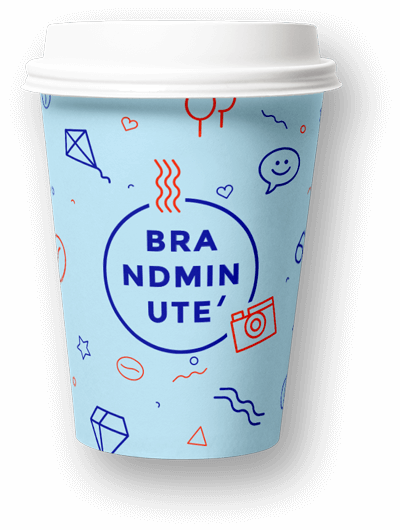
Brand Minute
Donut toffee candy brownie soufflé macaroon.
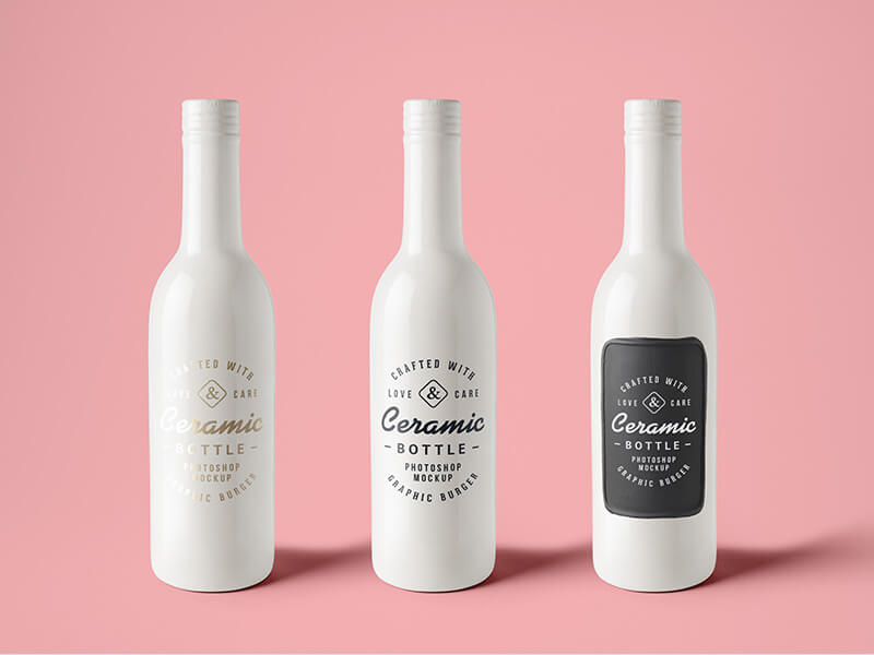
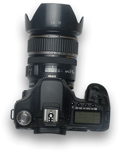
Ceramic Bottle
456 items
Brand Minute
Donut toffee candy brownie soufflé macaroon.

New Arriaval
Donut toffee candy brownie soufflé macaroon.
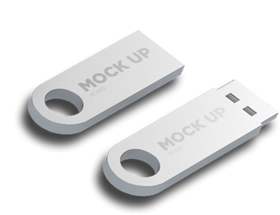
Storage Device
945 items
New Arriaval
Donut toffee candy brownie soufflé macaroon.
Outline variants
In need of a colored card, but not the hefty background colors they bring? Replace the default modifier classes
with the .border-* ones to style just the border-color of a card.
Brand Minute
Donut toffee candy brownie soufflé macaroon.
Ceramic Bottle
456 items
Brand Minute
Donut toffee candy brownie soufflé macaroon.
New Arriaval
Donut toffee candy brownie soufflé macaroon.
Storage Device
945 items
New Arriaval
Donut toffee candy brownie soufflé macaroon.
Groups
Use card groups to render cards as a single, attached element with equal width and height columns. By default,
card groups use display: table; and table-layout: fixed; to achieve their uniform sizing.
However, enabling flexbox mode can switch that to use display: flex; and provide the same effect.
Card title
This card has supporting text below as a natural lead-in to additional content.
Last updated 3 mins ago
Card title
This card has supporting text below as a natural lead-in to additional content.
Last updated 3 mins ago
Card title
This card has supporting text below as a natural lead-in to additional content.
Last updated 3 mins ago
Card title
This card has supporting text below as a natural lead-in to additional content.
Last updated 3 mins ago
Decks
Need a set of equal width and height cards that aren’t attached to one another? Use card decks. By default, card
decks require two wrapping elements: .card-deck-wrapper and a .card-deck. We use table
styles for the sizing and the gutters on .card-deck. The .card-deck-wrapper is used to
negative margin out the border-spacing on the .card-deck.
Card title
This card has supporting text below as a natural lead-in to additional content.
Last updated 3 mins ago
Card title
This card has supporting text below as a natural lead-in to additional content.
Last updated 3 mins ago
Card title
This card has supporting text below as a natural lead-in to additional content.
Last updated 3 mins ago
Card title
This card has supporting text below as a natural lead-in to additional content.
Last updated 3 mins ago
Columns
Cards can be organized into Masonry-like columns with just CSS by wrapping them in .card-columns.
Only applies to small devices and above.
Heads up! This is not available in IE9 and below as they have no support for the column-* CSS properties.
Card title
Some quick example text to build on the card title and make up the bulk of the card's content.
Go somewhere
Brand Minute
Donut toffee candy brownie soufflé macaroon.
Storage Device
945 items
Ceramic Bottle
456 items
Bottom Image Cap
Jelly-o sesame snaps cheesecake topping. Cupcake fruitcake macaroon donut pastry gummies tiramisu chocolate bar muffin. Dessert bonbon caramels brownie chocolate bar chocolate tart dragée.
Cupcake fruitcake macaroon donut pastry gummies tiramisu chocolate bar muffin.
Last updated 3 mins ago
New Arriaval
Donut toffee candy brownie soufflé macaroon.