# Card Statistics
# Overview
We have create different version of card components to make it easier for you to show your statistics neatly.
# Card Statistics Horizontal
import Icon from 'src/@core/components/icon'
import CardStatisticsHorizontal from 'src/@core/components/card-statistics/card-stats-horizontal'

const Component = () => (
  <CardStatisticsHorizontal
    stats='26%'
    icon='tabler:cpu'
    title='CPU Usage'
  />
)

export default Component
Result:

# Props
| Prop | Type | Required | Description |
|---|---|---|---|
| icon | ReactNode | Yes | Icon inside the avatar |
| stats | string | Yes | The statistic number on the card |
| title | string | Yes | Title of the card |
| sx | SxProps<Theme> | No | Add custom style using this prop |
| iconSize | number, string | No | Size of the icon |
| avatarSize | number | No | Size of the avatar |
| avatarColor | primary, secondary, success, error, warning, info | No | Color of the avatar |
# Card Statistics Horizontal With Details
import Icon from 'src/@core/components/icon'
import CardStatsHorizontalWithDetails from 'src/@core/components/card-statistics/card-stats-horizontal-with-details'
const Component = () => (
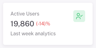
<CardStatsHorizontalWithDetails
stats='19,860'
trendDiff='-14'
trend='negative'
title='Active Users'
avatarColor='success'
icon='tabler:user-check'
subtitle='Last week analytics'
/>
)
export default Component
Result:
# Props
| Prop | Type | Required | Description |
|---|---|---|---|
| icon | ReactNode | Yes | Icon inside the avatar |
| stats | string | Yes | The statistic number on the card |
| title | string | Yes | Title of the card |
| subtitle | string | Yes | Subtitle of the card |
| trendDiff | string | Yes | To show the difference in numbers |
| sx | SxProps<Theme> | No | Add custom style using this prop |
| trend | positive, negative | No | To show the change in numbers than previous numbers |
| iconSize | number, string | No | Size of the icon |
| avatarSize | number | No | Size of the avatar |
| avatarColor | primary, secondary, success, error, warning, info | No | Color of the avatar |
# Card Statistics Square
import Icon from 'src/@core/components/icon'
import CardStatsSquare from 'src/@core/components/card-statistics/card-stats-square'
const Component = () => (
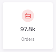
<CardStatsSquare
stats='97.8k'
title='Orders'
avatarColor='error'
icon='tabler:briefcase'
/>
)
export default Component
Result:
# Props
| Prop | Type | Required | Description |
|---|---|---|---|
| icon | ReactNode | Yes | Icon inside the avatar |
| stats | string | Yes | The statistic number on the card |
| title | string | Yes | Title of the card |
| sx | SxProps<Theme> | No | Add custom style using this prop |
| iconSize | number, string | No | Size of the icon |
| avatarSize | number | No | Size of the avatar |
| avatarColor | primary, secondary, success, error, warning, info | No | Color of the avatar |
# Card Statistics Vertical
import Icon from 'src/@core/components/icon'
import CardStatisticsVertical from 'src/@core/components/card-statistics/card-stats-vertical'
const Component = () => (
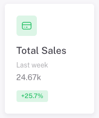
<CardStatisticsVertical
stats='24.67k'
chipText='+25.7%'
title='Total Sales'
chipColor='success'
subtitle='Last week'
avatarColor='success'
avatarIcon='tabler:credit-card'
/>
)
export default Component
Result:
# Props
| Prop | Type | Required | Description |
|---|---|---|---|
| stats | string | Yes | The statistic number on the card |
| title | string | Yes | Title of the card |
| chipText | string | Yes | Text inside the badge/chip |
| subtitle | string | Yes | Subtitle of the card |
| avatarIcon | ReactNode | Yes | Icon inside the avatar |
| sx | SxProps<Theme> | No | Add custom style using this prop |
| avatarSize | number | No | Size of the avatar |
| avatarColor | primary, secondary, success, error, warning, info | No | Color of the avatar |
| iconSize | number, string | No | Size of the icon |
| chipColor | default, primary, secondary, success, error, warning, info | No | Color of the badge/chip |
# Card Statistics With Area Chart
import Icon from 'src/@core/components/icon'
import CardStatisticsWithAreaChart from 'src/@core/components/card-statistics/card-stats-with-area-chart'
const Component = () => (
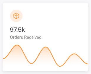
<CardStatisticsWithAreaChart
stats='97.5k'
chartColor='warning'
avatarColor='warning'
title='Orders Received'
avatarIcon='tabler:package'
chartSeries=[{ data: [30, 84, 11, 76, 0, 49, 9] }]
/>
)
export default Component
Result:
# Props
| Prop | Type | Required | Description |
|---|---|---|---|
| stats | string | Yes | The statistic number on the card |
| title | string | Yes | Title of the card |
| avatarIcon | ReactNode | Yes | Icon inside the avatar |
| chartSeries | ApexOptions['series'] | Yes | Series for the chart |
| sx | SxProps<Theme> | No | Add custom style using this prop |
| avatarSize | number | No | Size of the avatar |
| chartColor | primary, secondary, success, error, warning, info | No | Color of the chart |
| avatarColor | primary, secondary, success, error, warning, info | No | Color of the avatar |
| avatarIconSize | number, string | No | Size of the icon |