# Theming
# Overview
Theming is the most important aspect of any template. You can easily customize theme of our template. You can change the colors, the typography, the spacing and much more.
MUI offers a utility function: createTheme() that creates a theme which can be passed to the theme provider; otherwise the theme provider uses the default theme. The theme provider makes the theme available in the component tree, and can be used via the sx prop, or inside styled components using the MUI styled engine (styled).
Important
Make your changes in src/layouts/UserThemeOptions.ts file in order to override colors, typography, spacing or any other component styling. Do not make any changes related to theme inside of @core folder unless suggested by our support team.
Consider reading MUI theming docs (opens new window) to understand how it works and how to access and override theme.
- How to override Color Palette
- How to customize MUI component appearance
- How to override Typography
- How to override Shadows
- How to override Breakpoints
- How to override components styling
# How to override Color Palette
# How to Change Colors
In order to change primary color, open src/layouts/UserThemeOptions.ts file and uncomment the palette object returned from that file.
palette:{
  primary: {
    light: '#9E69FD',
    main: '#9155FD',
    dark: '#804BDF',
    contrastText: '#FFF'
  },
  secondary: {
    ...
  },
  success: {
    ...
  },
  error: {
    ...
  },
  warning: {
    ...
  },
  info: {
    ...
  }
}
Colors given in the above palette object are current primary colors used in our template, update those colors according to your project requirements.
Above example shows how to change primary colors. You can change any colors of the palette in the same way shown above. Please refer how to customize MUI palette documentation (opens new window). Also refer our core palette from the file src/@core/theme/palette/index.ts in order to check custom colors, dark / light colors etc.. for better idea.
# Colors Tool
Eva color tool https://colors.eva.design/ (opens new window)
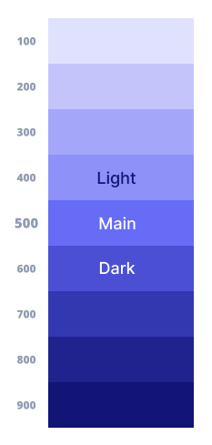
We recommend picking colors with these values:
- light : 400
- main : 500
- dark : 600
- contrastText: '#FFF'

# How to customize MUI component appearance
You can easily customize the appearance of any component, but it is important to understand how to customize it right way which will save the time, resources and provide optimum performance.
Please read MUI doc on how to customize component appearance (opens new window) to get clear idea.
# How to override Typography
# How to change font
We have used Inter fonts (opens new window) in the whole template. Now suppose you want to implement Montserrat fonts (opens new window).
First open src/pages/_document.tsx file and change font's URL like following:
<Head>
  ...
  <link
    rel='stylesheet'
    href='https://fonts.googleapis.com/css2?family=Montserrat:ital,wght@0,300;0,400;0,500;0,600;1,400&display=swap'
  />
  ...
</Head>
Now, open src/layouts/UserThemeOptions.ts file and uncomment typography object like following:
typography: {
  fontFamily:
    '"Montserrat", sans-serif'
}
# Use multiple fonts
typography: {
  fontFamily:
    '"Inter", sans-serif',
  h1: {
    fontFamily:
    '"Montserrat", sans-serif',
    fontWeight: 700,
    fontSize: '3.5rem',
    lineHeight: 1.375
  },
}
# How to override Shadows
If you want to customize shadows, uncomment following from the src/layouts/UserThemeOptions.ts file and change shadows according to your project requirement.
Make sure to enable mode from the settings which are already commented at the starting of this file if you are using dark / light both the versions. If you are using either of them, just override shadows without any conditions.
// Uncomment this if using light & dark both
const { mode } = settings
// conditional shadows for both dark / light
shadows: mode === 'light' ? [...] : [...]

// Only shadows if using only one from light / dark
shadows: [...]
# How to override Breakpoints
If you want to customize breakpoints, uncomment following from the src/layouts/UserThemeOptions.ts file and change breakpoints size according to your project requirement.
breakpoints: {
  values: {
    xs: 0,
    sm: 768,
    md: 992,
    lg: 1200,
    xl: 1920
  }
}
# How to override components styling
The theme's components key allows you to customize a component without wrapping it in another component. You can change the styles, the default props, and more.
Open src/layouts/UserThemeOptions.ts file and uncomment typography object like following:
components: {
  MuiButton: {
    defaultProps: {
      disableElevation: true
    },
    ...
  },
  ...
}
← Routing Deployment →