# Navigation Menu Structure
# Overview
While creating the navigation menu, you need to know the structure of it. On this page, you will understand how to create a navigation section title (which is only in the vertical navigation menu), navigation group and navigation link.
# Vertical Navigation Structure
Following are the items that you can create for your vertical navigation:
# 1. Navigation Section Header
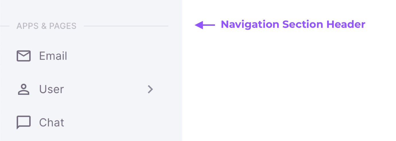
It is used to group some navigation groups and/or navigation links in some sections. This is only used in the vertical navigation menu. To create a navigation section, you need to add an object with the following structure:
type NavSectionTitle = {
  action?: string
  subject?: string
  sectionTitle: string
}
Here is the example code:
{
  sectionTitle: 'Apps & Pages'
}
Result:

# 2. Navigation Group
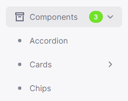
It is used to group some navigation groups and/or navigation links that can be treated as an accordion or a collapse. To create a navigation group, you need to add an object with the following structure:
// For Static Navigation Menu
type NavGroup = {
  title: string
  action?: string
  subject?: string
  badgeContent?: string
  children?: (NavGroup | NavLink)[]
  icon?: string | string[] | ReactNode
  badgeColor?: 'default' | 'primary' | 'secondary' | 'success' | 'error' | 'warning' | 'info'
}

// For Server Side Navigation Menu
type NavGroup = {
  icon?: string
  title: string
  action?: string
  subject?: string
  badgeContent?: string
  children?: (NavGroup | NavLink)[]
  badgeColor?: 'default' | 'primary' | 'secondary' | 'success' | 'error' | 'warning' | 'info'
}
Here is the example code:
Result:

# 3. Navigation Link
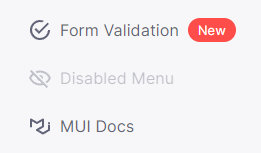
To create a navigation link, you need to add an object with the following structure:
// For Static Navigation Menu
type NavLink = {
  path?: string
  title: string
  action?: string
  subject?: string
  disabled?: boolean
  badgeContent?: string
  externalLink?: boolean
  openInNewTab?: boolean
  icon?: string | string[] | ReactNode
  badgeColor?: 'default' | 'primary' | 'secondary' | 'success' | 'error' | 'warning' | 'info'
}

// For Server Side Navigation Menu
type NavLink = {
  icon?: string
  path?: string
  title: string
  action?: string
  subject?: string
  disabled?: boolean
  badgeContent?: string
  externalLink?: boolean
  openInNewTab?: boolean
  badgeColor?: 'default' | 'primary' | 'secondary' | 'success' | 'error' | 'warning' | 'info'
}
Here is the example code:
Result:

# Horizontal Navigation Structure
Important!
So, you have decided to use the Horizontal Layout and will create Horizontal Navigation based on the below docs. Please note that on smaller screens, our layout is converted to Vertical and you will also need to create Vertical Navigation.
Please refer to the Vertical Navigation Structure guide as well.
Following are the items that you can create for your horizontal navigation:
# 1. Navigation Group
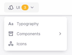
It is used to group some navigation groups and/or navigation links that are opened in a tooltip. To create a navigation group, you need to add an object with the following structure:
// For Static Navigation Menu
type NavGroup = {
  title: string
  action?: string
  subject?: string
  badgeContent?: string
  children?: (NavGroup | NavLink)[]
  icon?: string | string[] | ReactNode
  badgeColor?: 'default' | 'primary' | 'secondary' | 'success' | 'error' | 'warning' | 'info'
}

// For Server Side Navigation Menu
type NavGroup = {
  icon?: string
  title: string
  action?: string
  subject?: string
  badgeContent?: string
  children?: (NavGroup | NavLink)[]
  badgeColor?: 'default' | 'primary' | 'secondary' | 'success' | 'error' | 'warning' | 'info'
}
Here is the example code:
Result:

# 2. Navigation Link
To create a navigation link, you need to add an object with the following structure:
// For Static Navigation Menu
type NavLink = {
  path?: string
  title: string
  action?: string
  subject?: string
  disabled?: boolean
  badgeContent?: string
  externalLink?: boolean
  openInNewTab?: boolean
  icon?: string | string[] | ReactNode
  badgeColor?: 'default' | 'primary' | 'secondary' | 'success' | 'error' | 'warning' | 'info'
}

// For Server Side Navigation Menu
type NavLink = {
  icon?: string
  path?: string
  title: string
  action?: string
  subject?: string
  disabled?: boolean
  badgeContent?: string
  externalLink?: boolean
  openInNewTab?: boolean
  badgeColor?: 'default' | 'primary' | 'secondary' | 'success' | 'error' | 'warning' | 'info'
}
Here is the example code:
Result:
