# Layout Components
# Overview
On this page, you'll get to know how the layout components are rendered so that it would be easy for you to override these layout components.
# Vertical Layout Components
Vertical Layout is formed with the following layout components. Let's understand each one of them:
# 1. Navigation Menu (left sidebar)
The navigation menu is created with the following components:
Navigation Header which uses the
VerticalNavHeadercomponent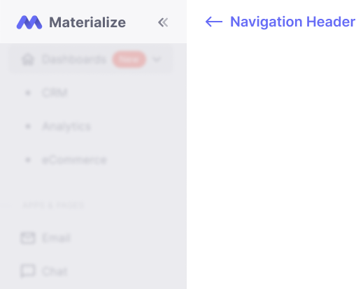
VerticalNavItemscomponent is used to categorize whether an item is a section header, navigation group or navigation linkNavigation Section Header which uses the
VerticalNavSectionTitlecomponent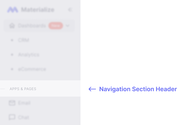
Navigation Group which uses the
VerticalNavGroupcomponent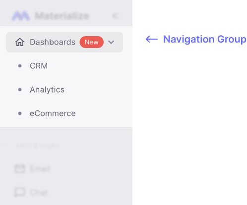
Navigation Link which uses the
VerticalNavLinkcomponent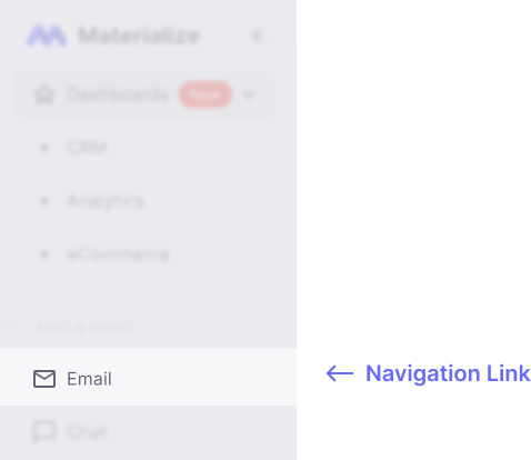
# 2. Navbar (or AppBar)
AppBar is created with the following components:
# Left side section
- Template Search which uses the
Autocompletecomponent
# Right side section
- Change language by using the
LanguageDropdowncomponent - Light and Dark Mode Toggler which uses the
ModeTogglercomponent - Notifications of the User which uses the
NotificationDropdowncomponent - User Actions which uses the
UserDropdowncomponent
# 3. Footer
Footer is created with the following components:
- Copyright on the left side
- Important links of the company on the right side
# Horizontal Layout Components
Horizontal Layout is formed with the following layout components. Let's understand each one of them:
# 1. Navbar (or AppBar)
AppBar is created with the following components:
# Left side section
- Company Logo and/or Company Name
# Right side section
- Template Search which uses the
Autocompletecomponent - Change language by using the
LanguageDropdowncomponent - Light and Dark Mode Toggler which uses the
ModeTogglercomponent - Notifications of the User which uses the
NotificationDropdowncomponent - User Actions which uses the
UserDropdowncomponent
# 2. Navigation Menu
The navigation menu is created with the following components:
HorizontalNavItemscomponent is used to categorize whether an item is a navigation group or navigation linkNavigation Group which uses the
HorizontalNavGroupcomponent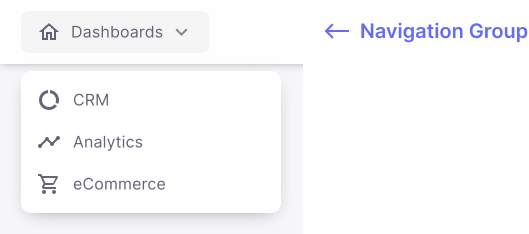
Navigation Link which uses the
HorizontalNavLinkcomponent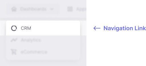
# 3. Footer
Footer is created with the following components:
- Copyright on left side
- Important links of the company on the right side
# Blank Layout with AppBar Component
Blank Layout with AppBar provides only appBar (at top of the page) which contains the Company logo and Company name only.
# Scroll to top Component
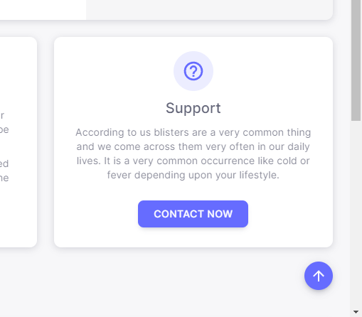
Fab button is created at the bottom-right side of a page to scroll to the top of the page. It is available only in Vertical and Horizontal layouts. It is not visible at top of the page. It is only visible when the page is scrolled more than 400px.
