# TextField
# Overview
Please visit MUI TextField Docs (opens new window) for a proper explanation of the TextField component.
TextField component is slightly modified to make it more beautiful and useable. Let's have a glance.
Note
We have styled the TextField component but you can still use the default MUI TextField's props.
WARNING
You won't be able to change the variant and shrink for the CustomTextField component.
# Usage
Here is an example of how to use the CustomTextField component:
import CustomTextField from 'src/@core/components/mui/text-field'

const SomeComponent = () => {
  return <CustomTextField label='Default' />
}

export default SomeComponent
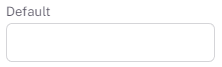
Result:
← Chip Timeline Dot →