Cards
Cards provide a flexible and extensible content container with multiple variants and options..
Read the official Bootstrap Documentation for a full list of instructions and other options.
Basic Example
Cards are built with as little markup and styles as possible, but still manage to deliver a ton of control and customization. Built with flexbox, they offer easy alignment and mix well with other Bootstrap components. They have no margin by default, so use spacing utilities as needed.
Below is an example of a basic card with mixed content and a fixed width. Cards have no fixed width to start, so they’ll naturally fill the full width of its parent element.

<div class="card" style="width: 18rem;">
  <img src="" class="card-img-top" alt="...">
  <div class="card-body">
    <h5 class="card-title">Card title</h5>
    <p class="card-text">Some quick example text to build on the card title and make up the bulk of the card's content.</p>
    <a href="#" class="btn btn-primary">Go somewhere</a>
  </div>
</div>Header and Footer
Add an optional header and/or footer within a card.
Text Alignment
You can quickly change the text alignment of any card—in its entirety or specific parts—with our text align classes.
Special title treatment
With supporting text below as a natural lead-in to additional content.
Go somewhereSpecial title treatment
With supporting text below as a natural lead-in to additional content.
Go somewhereSpecial title treatment
With supporting text below as a natural lead-in to additional content.
Go somewhere<div class="card" style="width: 18rem;">
<div class="card-body">
<h5 class="card-title">Special title treatment</h5>
<p class="card-text">With supporting text below as a natural lead-in to additional content.</p>
<a href="#" class="btn btn-primary">Go somewhere</a>
</div>
</div>
<div class="card text-center" style="width: 18rem;">
<div class="card-body">
<h5 class="card-title">Special title treatment</h5>
<p class="card-text">With supporting text below as a natural lead-in to additional content.</p>
<a href="#" class="btn btn-primary">Go somewhere</a>
</div>
</div>
<div class="card text-end" style="width: 18rem;">
<div class="card-body">
<h5 class="card-title">Special title treatment</h5>
<p class="card-text">With supporting text below as a natural lead-in to additional content.</p>
<a href="#" class="btn btn-primary">Go somewhere</a>
</div>
</div>Images
Cards include a few options for working with images. Choose from appending “image caps” at either end of a card, overlaying images with card content, or simply embedding the image in a card.
Image caps
Similar to headers and footers, cards can include top and bottom “image caps”—images at the top or bottom of a card.

Card title
This is a wider card with supporting text below as a natural lead-in to additional content. This content is a little bit longer.
Last updated 3 mins ago
Card title
This is a wider card with supporting text below as a natural lead-in to additional content. This content is a little bit longer.
Last updated 3 mins ago
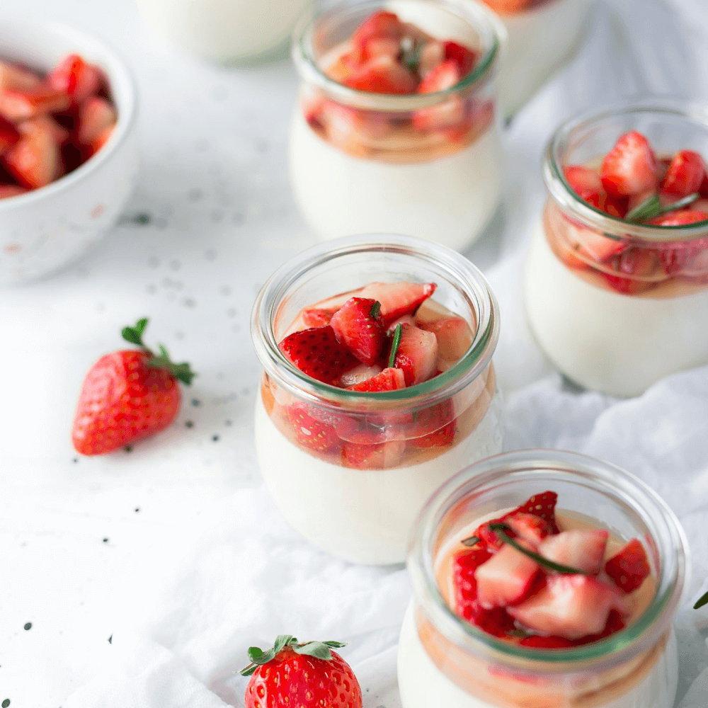
<div class="card mb-4">
  <img src="" class="card-img-top" alt="...">
  <div class="card-body">
    <h5 class="card-title">Card title</h5>
    <p class="card-text">This is a wider card with supporting text below as a natural lead-in to additional content. This content is a little bit longer.</p>
    <p class="card-text"><small class="text-body-secondary">Last updated 3 mins ago</small></p>
  </div>
</div>
<div class="card">
  <div class="card-body">
    <h5 class="card-title">Card title</h5>
    <p class="card-text">This is a wider card with supporting text below as a natural lead-in to additional content. This content is a little bit longer.</p>
    <p class="card-text"><small class="text-body-secondary">Last updated 3 mins ago</small></p>
  </div>
  <img src="" class="card-img-bottom" alt="...">
</div>
Image Overlays
Turn an image into a card background and overlay your card’s text. Depending on the image, you may or may not need additional styles or utilities.

<div class="card bg-dark text-white">
  <img src="" class="card-img" alt="...">
  <div class="card-img-overlay">
    <h5 class="card-title">Card title</h5>
    <p class="card-text">This is a wider card with supporting text below as a natural lead-in to additional content. This content is a little bit longer.</p>
    <p class="card-text">Last updated 3 mins ago</p>
  </div>
</div>
Horizontal
Using a combination of grid and utility classes, cards can be made horizontal in a mobile-friendly and responsive way. In the example below, we remove the grid gutters with .g-0 and use .col-md-* classes to make the card horizontal at the md breakpoint. Further adjustments may be needed depending on your card content.

Card title
This is a wider card with supporting text below as a natural lead-in to additional content. This content is a little bit longer.
Last updated 3 mins ago
Card title
This is a wider card with supporting text below as a natural lead-in to additional content. This content is a little bit longer.
Last updated 3 mins ago

<div class="row">
  <div class="col-md">
    <div class="card mb-4">
      <div class="row g-0">
        <div class="col-md-4">
          <img class="card-img card-img-left" src="../../assets/img/elements/12.png" alt="Card image" />
        </div>
        <div class="col-md-8">
          <div class="card-body">
            <h5 class="card-title">Card title</h5>
            <p class="card-text">
              This is a wider card with supporting text below as a natural lead-in to additional content. This content
              is a
              little bit longer.
            </p>
            <p class="card-text"><small class="text-body-secondary">Last updated 3 mins ago</small></p>
          </div>
        </div>
      </div>
    </div>
  </div>
  <div class="col-md">
    <div class="card mb-4">
      <div class="row g-0">
        <div class="col-md-8">
          <div class="card-body">
            <h5 class="card-title">Card title</h5>
            <p class="card-text">
              This is a wider card with supporting text below as a natural lead-in to additional content. This content
              is a
              little bit longer.
            </p>
            <p class="card-text"><small class="text-body-secondary">Last updated 3 mins ago</small></p>
          </div>
        </div>
        <div class="col-md-4">
          <img class="card-img card-img-right" src="../../assets/img/elements/17.png" alt="Card image" />
        </div>
      </div>
    </div>
  </div>
</div>
Card styles
Cards include various options for customizing their backgrounds, borders, and color.
Background and color
Use text and background utilities to change the appearance of a card.
Primary card title
Some quick example text to build on the card title and make up.
Secondary card title
Some quick example text to build on the card title and make up.
Success card title
Some quick example text to build on the card title and make up.
<div class="row g-6">
  <div class="col-md">
    <div class="card text-bg-primary">
      <div class="card-body">
        <h5 class="card-title text-white">Primary card title</h5>
        <p class="card-text">Some quick example text to build on the card title and make up.</p>
      </div>
    </div>
  </div>
  <div class="col-md">
    <div class="card text-bg-secondary">
      <div class="card-body">
        <h5 class="card-title text-white">Secondary card title</h5>
        <p class="card-text">Some quick example text to build on the card title and make up.</p>
      </div>
    </div>
  </div>
  <div class="col-md">
    <div class="card text-bg-success">
      <div class="card-body">
        <h5 class="card-title text-white">Success card title</h5>
        <p class="card-text">Some quick example text to build on the card title and make up.</p>
      </div>
    </div>
  </div>
</div>| Class | Value |
|---|---|
class="card text-bg-{value}"
|
primary | secondary | success | danger | warning | info | light | dark |
Label
Use text and background utilities to change the appearance of a card.
Primary card title
Some quick example text to build on the card title and make up.
Secondary card title
Some quick example text to build on the card title and make up.
Success card title
Some quick example text to build on the card title and make up.
<div class="row g-6">
  <div class="col-md">
    <div class="card shadow-none bg-label-primary">
      <div class="card-body">
        <h5 class="card-title text-primary">Primary card title</h5>
        <p class="card-text">Some quick example text to build on the card title and make up.</p>
      </div>
    </div>
  </div>
  <div class="col-md">
    <div class="card shadow-none bg-label-secondary">
      <div class="card-body">
        <h5 class="card-title text-secondary">Secondary card title</h5>
        <p class="card-text">Some quick example text to build on the card title and make up.</p>
      </div>
    </div>
  </div>
  <div class="col-md">
    <div class="card shadow-none bg-label-success">
      <div class="card-body">
        <h5 class="card-title text-success">Success card title</h5>
        <p class="card-text">Some quick example text to build on the card title and make up.</p>
      </div>
    </div>
  </div>
</div>| Class | Value |
|---|---|
class="card bg-label-{value}"
|
primary | secondary | success | danger | warning | info | light | dark |
Border
Use border utilities to change just the border-color of a card. Note that you can put .text-{color} classes on the parent .card or a subset of the card’s contents as shown below.
Primary card title
Some quick example text to build on the card title and make up the bulk of the card's content.
Secondary card title
Some quick example text to build on the card title and make up the bulk of the card's content.
Success card title
Some quick example text to build on the card title and make up the bulk of the card's content.
<div class="row gy-4">
<div class="col-md">
  <div class="card shadow-none bg-label-primary">
    <div class="card-body text-primary">
      <h5 class="card-title text-primary">Primary card title</h5>
      <p class="card-text">
        Some quick example text to build on the card title and make up the bulk of the card's content.
      </p>
    </div>
  </div>
</div>
<div class="col-md">
  <div class="card shadow-none bg-label-secondary">
    <div class="card-body text-secondary">
      <h5 class="card-title text-secondary">Secondary card title</h5>
      <p class="card-text">
        Some quick example text to build on the card title and make up the bulk of the card's content.
      </p>
    </div>
  </div>
</div>
<div class="col-md">
  <div class="card shadow-none bg-label-success">
    <div class="card-body text-success">
      <h5 class="card-title text-success">Success card title</h5>
      <p class="card-text">
        Some quick example text to build on the card title and make up the bulk of the card's content.
      </p>
    </div>
  </div>
</div>
</div>
Border
Use border utilities to change just the border-color of a card. Note that you can put .text-{color} classes on the parent .card or a subset of the card’s contents as shown below.
Primary card title
Some quick example text to build on the card title and make up.
Secondary card title
Some quick example text to build on the card title and make up.
Success card title
Some quick example text to build on the card title and make up.
<div class="row g-6">
  <div class="col-md">
    <div class="card shadow-none bg-transparent border border-primary text-primary">
      <div class="card-body">
        <h5 class="card-title text-primary">Primary card title</h5>
        <p class="card-text">Some quick example text to build on the card title and make up.</p>
      </div>
    </div>
  </div>
  <div class="col-md">
    <div class="card shadow-none bg-transparent border border-secondary text-secondary">
      <div class="card-body">
        <h5 class="card-title text-secondary">Secondary card title</h5>
        <p class="card-text">Some quick example text to build on the card title and make up.</p>
      </div>
    </div>
  </div>
  <div class="col-md">
    <div class="card shadow-none bg-transparent border border-success text-success">
      <div class="card-body">
        <h5 class="card-title text-success">Success card title</h5>
        <p class="card-text">Some quick example text to build on the card title and make up.</p>
      </div>
    </div>
  </div>
</div>
Card Layouts
In addition to styling the content within cards, Bootstrap includes a few options for laying out series of cards. For the time being, these layout options are not yet responsive.
Card Groups
Use card groups to render cards as a single, attached element with equal width and height columns. Card groups start off stacked and use display: flex; to become attached with uniform dimensions starting at the sm breakpoint.
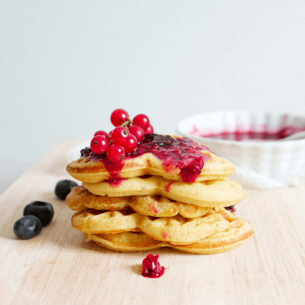
Card title
This is a wider card with supporting text below as a natural lead-in to additional content. This content is a little bit longer.
Last updated 3 mins ago

Card title
This card has supporting text below as a natural lead-in to additional content.
Last updated 3 mins ago

Card title
This is a wider card with supporting text below as a natural lead-in to additional content. This card has even longer content than the first to show that equal height action.
Last updated 3 mins ago
<div class="card-group">
  <div class="card">
    <img src="" class="card-img-top" alt="...">
    <div class="card-body">
      <h5 class="card-title">Card title</h5>
      <p class="card-text">This is a wider card with supporting text below as a natural lead-in to additional content. This content is a little bit longer.</p>
      <p class="card-text"><small class="text-body-secondary">Last updated 3 mins ago</small></p>
    </div>
  </div>
  <div class="card">
    <img src="" class="card-img-top" alt="...">
    <div class="card-body">
      <h5 class="card-title">Card title</h5>
      <p class="card-text">This card has supporting text below as a natural lead-in to additional content.</p>
      <p class="card-text"><small class="text-body-secondary">Last updated 3 mins ago</small></p>
    </div>
  </div>
  <div class="card">
    <img src="" class="card-img-top" alt="...">
    <div class="card-body">
      <h5 class="card-title">Card title</h5>
      <p class="card-text">This is a wider card with supporting text below as a natural lead-in to additional content. This card has even longer content than the first to show that equal height action.</p>
      <p class="card-text"><small class="text-body-secondary">Last updated 3 mins ago</small></p>
    </div>
  </div>
</div>
Grid cards
Use the Bootstrap grid system and its
.row-cols classes to control how many grid columns (wrapped around your cards) you show per row. For example, here’s .row-cols-1 laying out the cards on one column, and .row-cols-md-2 splitting four cards to equal width across multiple rows, from the medium breakpoint up.

Card title
This is a longer card with supporting text below as a natural lead-in to additional content. This content is a little bit longer.

Card title
This is a longer card with supporting text below as a natural lead-in to additional content. This content is a little bit longer.

Card title
This is a longer card with supporting text below as a natural lead-in to additional content.

Card title
This is a longer card with supporting text below as a natural lead-in to additional content. This content is a little bit longer.

Card title
This is a longer card with supporting text below as a natural lead-in to additional content. This content is a little bit longer.

Card title
This is a longer card with supporting text below as a natural lead-in to additional content. This content is a little bit longer.
<div class="row row-cols-1 row-cols-md-3 g-4">
<div class="col">
  <div class="card h-100">
    <img class="card-img-top" src="../../assets/img/elements/23.png" alt="Card image cap" />
    <div class="card-body">
      <h5 class="card-title">Card title</h5>
      <p class="card-text">This is a longer card with supporting text below as a natural lead-in to additional content. This content is a little bit longer.</p>
    </div>
  </div>
</div>
<div class="col">
  <div class="card h-100">
    <img class="card-img-top" src="../../assets/img/elements/24.png" alt="Card image cap" />
    <div class="card-body">
      <h5 class="card-title">Card title</h5>
      <p class="card-text">This is a longer card with supporting text below as a natural lead-in to additional content. This content is a little bit longer.</p>
    </div>
  </div>
</div>
<div class="col">
  <div class="card h-100">
    <img class="card-img-top" src="../../assets/img/elements/25.png" alt="Card image cap" />
    <div class="card-body">
      <h5 class="card-title">Card title</h5>
      <p class="card-text">This is a longer card with supporting text below as a natural lead-in to additional content.</p>
    </div>
  </div>
</div>
<div class="col">
  <div class="card h-100">
    <img class="card-img-top" src="../../assets/img/elements/18.png" alt="Card image cap" />
    <div class="card-body">
      <h5 class="card-title">Card title</h5>
      <p class="card-text">This is a longer card with supporting text below as a natural lead-in to additional content. This content is a little bit longer.</p>
    </div>
  </div>
</div>
<div class="col">
  <div class="card h-100">
    <img class="card-img-top" src="../../assets/img/elements/19.png" alt="Card image cap" />
    <div class="card-body">
      <h5 class="card-title">Card title</h5>
      <p class="card-text">This is a longer card with supporting text below as a natural lead-in to additional content. This content is a little bit longer.</p>
    </div>
  </div>
</div>
<div class="col">
  <div class="card h-100">
    <img class="card-img-top" src="../../assets/img/elements/20.png" alt="Card image cap" />
    <div class="card-body">
      <h5 class="card-title">Card title</h5>
      <p class="card-text">This is a longer card with supporting text below as a natural lead-in to additional content. This content is a little bit longer.</p>
    </div>
  </div>
</div>
</div>
Masonry
Masonry is not included in Bootstrap. Add it by including the JavaScript plugin manually.
<script src="../../assets/vendor/libs/masonry/masonry.js"></script>By adding data-masonry='{"percentPosition": true }' to the .row wrapper, we can combine the powers of Bootstrap's responsive grid and Masonry's positioning.

Card title that wraps to a new line
This is a longer card with supporting text below as a natural lead-in to additional content. This content is a little bit longer.
A well-known quote, contained in a blockquote element.

Card title
This card has supporting text below as a natural lead-in to additional content.
Last updated 3 mins ago
A well-known quote, contained in a blockquote element.
Card title
This card has a regular title and short paragraph of text below it.
Last updated 3 mins ago

A well-known quote, contained in a blockquote element.
Card title
This is another card with title and supporting text below. This card has some additional content to make it slightly taller overall.
Last updated 3 mins ago
<div class="row gy-4" data-masonry='{"percentPosition": true }'>
<div class="col-sm-6 col-lg-4">
  <div class="card">
    <img class="card-img-top" src="../../assets/img/elements/5.png" alt="Card image cap" />
    <div class="card-body">
      <h5 class="card-title">Card title that wraps to a new line</h5>
      <p class="card-text">This is a longer card with supporting text below as a natural lead-in to additional content. This content is a little bit longer.</p>
    </div>
  </div>
</div>
<div class="col-sm-6 col-lg-4">
  <div class="card p-4">
    <figure class="p-3 mb-0">
      <blockquote class="blockquote">
        <p>A well-known quote, contained in a blockquote element.</p>
      </blockquote>
      <figcaption class="blockquote-footer mb-0 text-body-secondary">
        Someone famous in <cite title="Source Title">Source Title</cite>
      </figcaption>
    </figure>
  </div>
</div>
<div class="col-sm-6 col-lg-4">
  <div class="card">
    <img class="card-img-top" src="../../assets/img/elements/3.png" alt="Card image cap" />
    <div class="card-body">
      <h5 class="card-title">Card title</h5>
      <p class="card-text">This card has supporting text below as a natural lead-in to additional content.</p>
      <p class="card-text"><small class="text-body-secondary">Last updated 3 mins ago</small></p>
    </div>
  </div>
</div>
<div class="col-sm-6 col-lg-4">
  <div class="card bg-primary text-white text-center p-4">
    <figure class="mb-0">
      <blockquote class="blockquote">
        <p>A well-known quote, contained in a blockquote element.</p>
      </blockquote>
      <figcaption class="blockquote-footer mb-0 text-white">
        Someone famous in <cite title="Source Title">Source Title</cite>
      </figcaption>
    </figure>
  </div>
</div>
<div class="col-sm-6 col-lg-4">
  <div class="card text-center">
    <div class="card-body">
      <h5 class="card-title">Card title</h5>
      <p class="card-text">This card has a regular title and short paragraph of text below it.</p>
      <p class="card-text"><small class="text-body-secondary">Last updated 3 mins ago</small></p>
    </div>
  </div>
</div>
<div class="col-sm-6 col-lg-4">
  <div class="card">
    <img class="card-img-top" src="../../assets/img/elements/4.png" alt="Card image cap" />
  </div>
</div>
<div class="col-sm-6 col-lg-4">
  <div class="card p-4 text-end">
    <figure class="mb-0">
      <blockquote class="blockquote">
        <p>A well-known quote, contained in a blockquote element.</p>
      </blockquote>
      <figcaption class="blockquote-footer mb-0 text-body-secondary">
        Someone famous in <cite title="Source Title">Source Title</cite>
      </figcaption>
    </figure>
  </div>
</div>
<div class="col-sm-6 col-lg-4">
  <div class="card">
    <div class="card-body">
      <h5 class="card-title">Card title</h5>
      <p class="card-text">This is another card with title and supporting text below. This card has some additional content to make it slightly taller overall.</p>
      <p class="card-text"><small class="text-body-secondary">Last updated 3 mins ago</small></p>
    </div>
  </div>
</div>
</div>