# Card Statistics
# Overview
We have create different version of card components to make it easier for you to show your statistics neatly.
# Card Statistics Horizontal
import Icon from 'src/@core/components/icon'
import CardStatisticsHorizontal from 'src/@core/components/card-statistics/card-stats-horizontal'
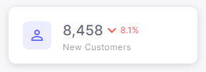
const Component = () => (
<CardStatisticsHorizontal
stats='8,458'
trend='negative'
trendNumber='8.1%'
title='New Customers'
icon={<Icon icon='mdi:account-outline' />}
/>
)
export default Component
Result:
# Props
| Prop | Type | Required | Description |
|---|---|---|---|
| icon | ReactNode | Yes | Icon inside the avatar |
| stats | string | Yes | The statistic number on the card |
| title | string | Yes | Title of the card |
| trendNumber | string | Yes | To show the difference in numbers |
| color | primary, secondary, success, error, warning, info | No | Color of the icon inside the avatar |
| trend | positive, negative | No | To show the change in numbers than previous numbers |
# Card Statistics Vertical
import Icon from 'src/@core/components/icon'
import CardStatisticsVertical from 'src/@core/components/card-statistics/card-stats-vertical'
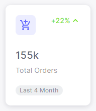
const Component = () => (
<CardStatisticsVertical
stats='155k'
trendNumber='+22%'
title='Total Orders'
chipText='Last 4 Month'
icon={<Icon icon='mdi:cart-plus' />}
/>
)
export default Component
Result:
# Props
| Prop | Type | Required | Description |
|---|---|---|---|
| icon | ReactNode | Yes | Icon inside the avatar |
| stats | string | Yes | The statistic number on the card |
| title | string | Yes | Title of the card |
| chipText | string | Yes | Label of the chip |
| trendNumber | string | Yes | To show the difference in numbers |
| color | primary, secondary, success, error, warning, info | No | Color of the avatar |
| trend | positive, negative | No | To show the change in numbers than previous numbers |
# Card Statistics Image
import CardStatisticsImg from 'src/@core/components/card-statistics/card-stats-with-image'
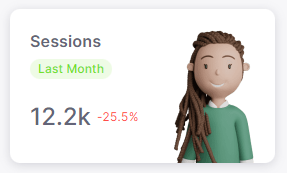
const Component = () => (
<CardStatisticsImg
src='...'
stats='12.2k'
title='Sessions'
trend='negative'
chipColor='success'
trendNumber='-25.5%'
chipText='Last Month'
/>
)
export default Component
Result:
# Props
| Prop | Type | Required | Description |
|---|---|---|---|
| src | string | Yes | Path of the image |
| stats | string | Yes | The statistic number on the card |
| title | string | Yes | Title of the card |
| chipText | string | Yes | Label of the chip |
| trendNumber | string | Yes | To show the difference in numbers |
| trend | positive, negative | No | To show the change in numbers than previous numbers |
| chipColor | primary, secondary, success, error, warning, info | No | Color of the chip |