# Core Card
To use core-card component import CoreCardModule to the respective NgModule.
# Requirements
import { CoreCardModule } from '@core/components/core-card/core-card.module';
...
...
@NgModule({
declarations: [
...
],
imports: [
 ...
 CoreCardModule
],
providers: []
})
TIP
We have an Event-Emitter named (events) that emits the action name when it triggers. This will help developer to trigger a custom event/function/method.
# Usage
Example :
<core-card
  (events)="emittedEvents($event)"
  [actions]="['collapse', 'expand', 'reload', 'close']"
  [reloadTime]="'1000'"
  [isReload]="false"
>
  <div class="core-card-title">Title</div>
  <div class="core-card-body">Body</div>
</core-card>
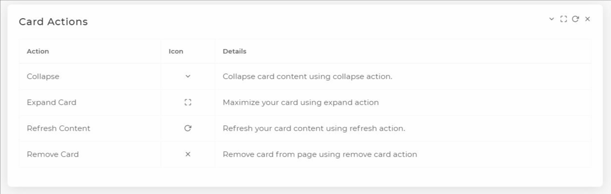
# Collapsible
You can create a collapsible content by by adding [actions]="['collapse']" along
with <core-card><core-card> component.
<core-card [actions]="['collapse']">
  <div class="core-card-title">Collapsible</div>
  <div class="core-card-body">Body</div>
</core-card>

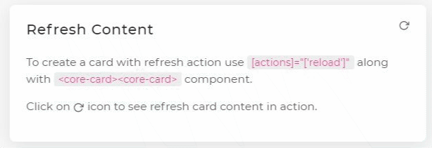
# Refresh Content
To create a card with refresh action use [actions]="['reload']" along with
<core-card><core-card> component.
TIP
core-card have props named [reloadTime] & [isReload]. Here prop reloadTime sets the time in milliseconds to load the loading screen. And isReload is used to manually trigger the loading screen.
WARNING
It is recommonded to use any one of the prop at once.
isReload prop's priority is higher then reloadTime. Example: If you used both the props simultaneously then isReload will be preferred first then reloadTime.
<core-card [actions]="['reload']">
  <div class="core-card-title">Refresh Content</div>
  <div class="core-card-body">Body</div>
</core-card>
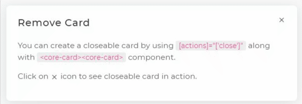
# Remove Card
You can create a closeable card by using [actions]="['close']" along with
<core-card><core-card> component.
<core-card [actions]="['close']">
  <div class="core-card-title">Remove Card</div>
  <div class="core-card-body"> Body
  </div>
</core-card>
# Expand Card
You can maximize the card by using [actions]="['expand']" along with
<core-card><core-card> component.
<core-card [actions]="['expand']">
  <div class="core-card-title">Expand Card</div>
  <div class="core-card-body">Body</div>
</core-card>

# API
| Component | Selector | Property | Description |
|---|---|---|---|
| CoreCardComponent | core-card | actions Type: String[] | Refresh / Remove / Expand action card by passing ['collapse' | 'expand' | 'reload' | 'close'] to actions input property. |
| CoreCardComponent | core-card | events Type: EventEmitter | Emits event-name that is triggered. Example : If you clicked on collapse action then it will emit event with name "collapse" in $event. Syntax : (events)="emittedEvents($event)" |
| CoreCardComponent | core-card | reloadTime Type: Number | Time in milliseconds to appear the loading screen (for refresh event). Default : 2500ms (for refresh action). |
| CoreCardComponent | core-card | isReload Type: Boolean | To manually trigger the loading screen. If true loading screen will appear & if false loading screen will disappear. Default : false (for refresh action). . |
| Property | Class | Description |
|---|---|---|
| Title | .core-card-title | To add Title to the core-card component. |
| Body | .core-card-body | To add Body to the core-card component. |
You can check the demo on this (opens new window) page.