# Layout Components
# Content Header
Indicate the current page’s name with an action button.
TIP
Use exiting layout components or create your own and use it in Core Layouts
# Requirements
To use content header component, we need to import the ContentHeaderModule to that specific module.
import { ContentHeaderModule } from 'app/layout/components/content-header/content-header.module';
...
...
@NgModule({
  declarations: [
  ...
  ],
  imports: [
    ...
    ContentHeaderModule
  ],
  providers: []
})
# Configuration
Interface
// ContentHeader component interface
export interface ContentHeader {
  headerTitle: string
  actionButton: boolean
  breadcrumb?: {
    type?: string
    links?: Array<{
      name?: string
      isLink?: boolean
      link?: string
    }>
  }
}
# Usage
Example :
<app-content-header [contentHeader]="contentHeaderVariable"></app-content-header>
import { ContentHeader } from './../../../layout/components/content-header/content-header.component';

public contentHeaderVariable: ContentHeader;

ngOnInit() {
this.contentHeaderVariable = {
  headerTitle: 'Header Title',
  actionButton: true
};
}
Result :
Content Header :

Content Header with breadcrumb :

# API
| Name | Property | Description |
|---|---|---|
| Header Title | headerTitle | Set header Title |
| Action Button | actionButton | Boolean If true, Action button will appear. |
# Breadcrumb
Indicate the current page’s location within a navigational hierarchy that automatically adds separators via CSS.
# Requirements
To use Breadcrumb component, we need to import the BreadcrumbModule to that specific module.
import { BreadcrumbModule } from './app/layout/components/content-header/breadcrumb/breadcrumb.module.ts';
...
...
@NgModule({
  declarations: [
  ...
  ],
  imports: [
    ...
    BreadcrumbModule
  ],
  providers: []
})
# Configuration
Interface :
// Breadcrumb component interface
export interface Breadcrumb {
  type?: string
  responsive?: boolean
  alignment?: string
  links?: Array<{
    name: string
    isLink: boolean
    link?: string
  }>
}
# Usage
Example :
<app-breadcrumb [breadcrumb]="breadcrumbVariable"></app-breadcrumb>
import { Breadcrumb } from 'app/layout/components/content-header/breadcrumb/breadcrumb.component';
public breadcrumbVariable: Breadcrumb;
this.breadcrumbVariable = {
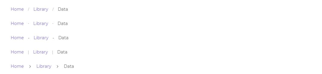
type: 'slash', // slash, dots, dashes, pipes, chevron
responsive: false,
links: [
{
name: 'Home',
isLink: true,
link: '#'
},
{
name: 'Library',
isLink: true,
link: ''
},
{
name: 'Data',
isLink: false
}
]
};
Breadcrumb Default :

Breadcrumb with Types :
# API
# Component
| Name | Selector | Input | Description |
|---|---|---|---|
| BreadcrumbsComponent | app-breadcrumbs | breadcrumb Type: Breadcrumb | Create Breadcrumb component by passing variable of type Breadcrumb to input property of app-breadcrumbs. |
# Property
| Name | Type | Description |
|---|---|---|
| type | string | Change the separator between breadcrumb item by changing type to slash | dots | dashes | pipes | chevron. Default type is chevrons |
| Name | Type | Description |
|---|---|---|
| name | string | Name of the breadcrumb. |
| isLink | boolean | If true, name will have an anchored link. |
| link | string | Link attached as anchor to the name. |
# Navbar
# Requirements
To use the navbar component. we need to import the NavbarModule to that specific module.
module.ts :
import { NavbarModule } from 'app/layout/components/navbar/navbar.module';
...
...

@NgModule({
  declarations: [
    ...
    ...
   ],
  imports: [
    ...
    NavbarModule
  ],
  providers: []
})
# Usage
Example :
You can also pass different configurations to navbar component. Here is an example where we have used navbar in Vertical layout.
component.html :
<app-navbar
  *ngIf="!coreConfig.layout.navbar.hidden"
  [ngClass]="
      coreConfig.layout.navbar.customBackgroundColor === true
        ? coreConfig.layout.navbar.background +
          ' ' +
          coreConfig.layout.navbar.type +
          ' ' +
          coreConfig.layout.navbar.backgroundColor
        : coreConfig.layout.navbar.background + ' ' + coreConfig.layout.navbar.type
    "
  class="header-navbar navbar navbar-expand-lg align-items-center navbar-shadow"
>
</app-navbar>
Result :

TIP
Search, cart, bookmark & notification components are not required. You can remove it if you want.
TIP
Vuexy Angular use fake API to display notification, bookmark, Search & cart data, you can use your API to display actual data.
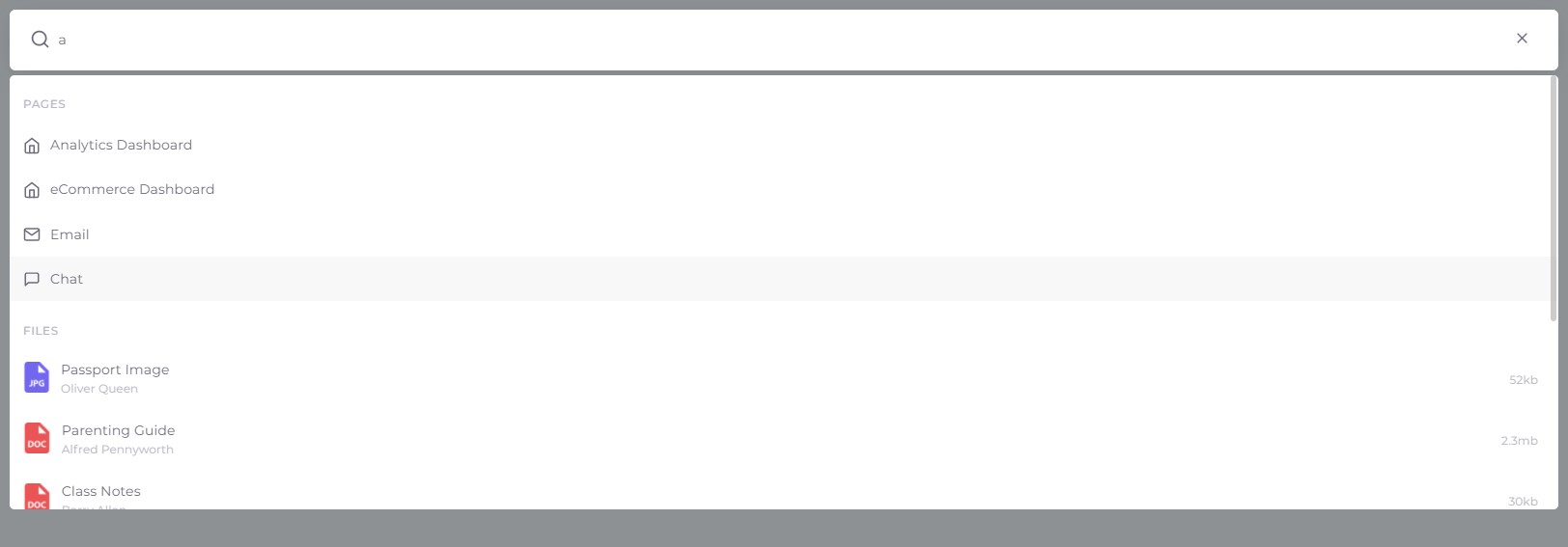
# Search
If you want to use the search component in the navbar, you can use app-navbar-search component in the navbar component file.
<app-navbar-search></app-navbar-search>
We have used fakeDB for getting the search data.
The path to file : src\@fake-db\search.data.ts
To integrate your search API you need to navigate to file : src\app\layout\components\navbar\navbar-search\search.service.ts
  getSearchData(): Promise<any[]> {
    return new Promise((resolve, reject) => {
      this._httpClient.get('update-your-api-here').subscribe((response: any) => {
        this.apiData = response;
        this.onApiDataChange.next(this.apiData);
        resolve(this.apiData);
      }, reject);
    });
  }
Result :
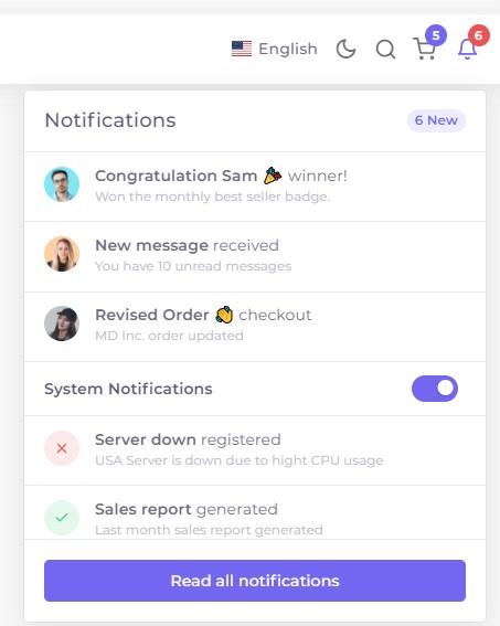
# Notification
If you want to use the notification component in the navbar, you can use app-navbar-notification component in the navbar component file.
<app-navbar-notification></app-navbar-notification>
We have used fakeDB for getting the search data.
The path to file : src\@fake-db\notification.data.ts
To integrate your search API you need to navigate to file : src\app\layout\components\navbar\navbar-notifications\notifications.service.ts
  getNotificationsData(): Promise<any[]> {
    return new Promise((resolve, reject) => {
      this._httpClient.get('update-your-api-here').subscribe((response: any) => {
        this.apiData = response;
        this.onApiDataChange.next(this.apiData);
        resolve(this.apiData);
      }, reject);
    });
  }
Result :
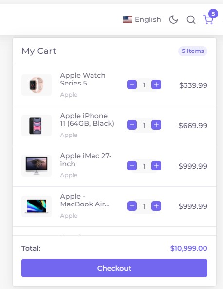
# Cart
If you want to use the Cart component in the navbar, you can use app-navbar-cart component in the navbar component file.
<app-navbar-cart></app-navbar-cart>
We have used fakeDB for getting the search data.
The path to file : src\@fake-db\ecommerce.data.ts
To integrate your search API you need to navigate to file : src\app\main\apps\ecommerce\ecommerce.service.ts
   getProducts(): Promise<any[]> {
    return new Promise((resolve, reject) => {
      this._httpClient.get('update-your-api-here').subscribe((response: any) => {
        this.productList = response;
        this.sortProduct('featured'); // Default shorting
        resolve(this.productList);
      }, reject);
    });
  }

    getCartList(): Promise<any[]> {
    return new Promise((resolve, reject) => {
      this._httpClient.get('update-your-api-here').subscribe((response: any) => {
        this.cartList = response;

        this.onCartListChange.next(this.cartList);
        resolve(this.cartList);
      }, reject);
    });
  }
Result :
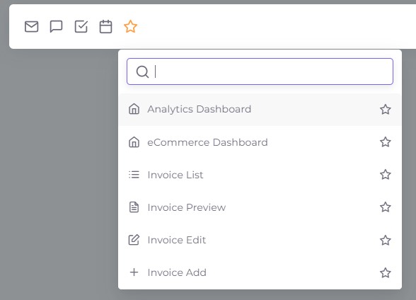
# Bookmark
If you want to use the bookmark component in the navbar, you can use app-navbar-bookmark component in the navbar component file.
<app-navbar-bookmark></app-navbar-bookmark>
We have used fakeDB for getting the search data.
The path to file : src\@fake-db\search.data.ts
To integrate your search API you need to navigate to file : src\app\layout\components\navbar\navbar-search\search.service.ts
  getSearchData(): Promise<any[]> {
    return new Promise((resolve, reject) => {
      this._httpClient.get('update-your-api-here').subscribe((response: any) => {
        this.apiData = response;
        this.onApiDataChange.next(this.apiData);
        resolve(this.apiData);
      }, reject);
    });
  }
Result :
# Footer
To use the footer component add FooterModule to that specific components module.
# Requirements
To use footer component, we need to import the FooterModule to that specific module.
import { FooterModule } from 'app/layout/components/footer/footer.module';
...
...
@NgModule({
  declarations: [
    ...
    ...
   ],
  imports: [
    ...
    FooterModule
  ],
  providers: []
})
# Usage
Example :
You can also pass different configurations to the footer component. Here is an example where we have used a footer in Vertical layout.
<footer
  *ngIf="!coreConfig.layout.footer.hidden"
  class="footer"
  [ngClass]="
      coreConfig.layout.footer.customBackgroundColor === true
        ? coreConfig.layout.footer.background +
          ' ' +
          coreConfig.layout.footer.type +
          ' ' +
          coreConfig.layout.footer.backgroundColor
        : coreConfig.layout.footer.background + ' ' + coreConfig.layout.footer.type
    "
></footer>
Result :
