# Alert
Alert component is slightly modified to make it more beautiful and provide custom animation. Let's have a glance.
# Alert Structure
We have added .alert-heading class for heading and .alert-body for body-content. Also we have added a class for link inside alert.
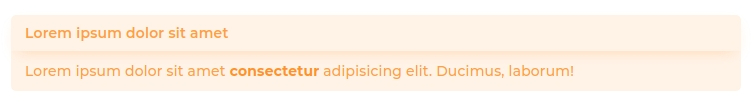
<b-alert variant="warning" show>
  <h4 class="alert-heading">
    Lorem ipsum dolor sit amet
  </h4>
  <div class="alert-body">
    Lorem ipsum dolor sit amet
    <b-link class="alert-link">
      consectetur
    </b-link>
    adipisicing elit. Ducimus, laborum!
  </div>
</b-alert>
Result:
# Alert Animation
By default alerts are not animated. Use the hightFaded directive to enable animation. If you want to show animation even when alert get rendered use appear modifier.
You can check demo in "Alert Animation" card on this (opens new window) page.