# Avatar
Avatar component is slightly modified to make it more beautiful. Let's have a glance.
# Avatar Light
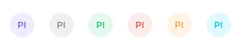
We have added light background avatar in our template. Prefix light- to Bootstrap's supported colors and use it as value of variant prop.
<div class="demo-inline-spacing">
  <b-avatar text="PI" variant="light-primary"/>
  <b-avatar text="PI" variant="light-secondary"/>
  <b-avatar text="PI" variant="light-success"/>
  <b-avatar text="PI" variant="light-danger"/>
  <b-avatar text="PI" variant="light-warning"/>
  <b-avatar text="PI" variant="light-info"/>
</div>
Result:
# Avatar Group with Pull Up
We have added a simple animation with Avatar Group on hover. You have to just add custom class pull-up to b-avatar component.
<b-avatar-group size="32px">
  <b-avatar class="pull-up" variant="success"/>
  <b-avatar class="pull-up" variant="primary"/>
  <b-avatar class="pull-up" variant="warning"/>
  <b-avatar class="pull-up" variant="danger"/>
  <b-avatar class="pull-up" variant="info"/>
</b-avatar-group>
You can check demo in "Avatar Group" card on this (opens new window) page.
# Badge Minimal
We have created a custom class .badge-minimal for badge to make it nice and small with border.
<b-avatar badge badge-variant="danger" icon="people-fill" class="badge-minimal" />
Result:
# Avatar Border
We have created custom class .avatar-border-2 for avatar thick border. It's only appear with Avatar with img.
<b-avatar variant="danger" size="lg" src="https://placekitten.com/300/300" class="avatar-border-2"></b-avatar>
Result: