# Statistics Cards
This contains 4 components with different layout/UI.
# Statistics Card Horizontal
<template>
  <statistic-card-horizontal icon="CpuIcon" statistic="86%" statistic-title="CPU Usage" style="max-width:300px" />
</template>

<script>
import StatisticCardHorizontal from '@core/components/statistics-cards/StatisticCardHorizontal.vue'

export default {
  components: {
    StatisticCardHorizontal,
  },
}
</script>
Result:
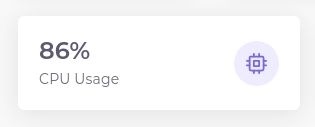
statistic-card-horizontal component renders content in two col and single row.
Below is props supported by this component:
- color: Bootstrap color variant to use (e.g.
success) - icon: feather icon name
- statistic: Statistics text (Value)
- statistic-title: Statistics title
# Statistics Card Vertical
<template>
  <statistic-card-vertical
    icon="EyeIcon"
    color="info"
    statistic="36.9k"
    statistic-title="Views"
    style="max-width:160px"
  />
</template>

<script>
import StatisticCardVertical from '@core/components/statistics-cards/StatisticCardVertical.vue'

export default {
  components: {
    StatisticCardVertical,
  },
}
</script>
Result:
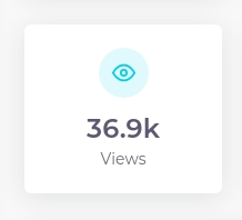
statistic-card-vertical component renders content in two row and single column.
Below is props supported by this component:
- color: Bootstrap color variant to use (e.g.
success) - icon: feather icon name
- statistic: Statistics text (Value)
- statistic-title: Statistics title
# Statistics Card With Area Chart
statistic-card-with-area-chart component renders content with area chart. It uses apex charts for chart.
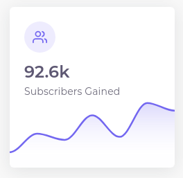
Below is props supported by this component:
- color: Bootstrap color variant to use (e.g.
success) - icon: feather icon name
- statistic: Statistics text (Value)
- statistic-title: Statistics title
- chartData: Chart Data
- chartOptions: Apex Chart options (optional - we configured already it)
# Statistics Card With Line Chart
statistic-card-with-line-chart component renders content with line chart. It uses apex charts for chart.
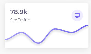
Below is props supported by this component:
- color: Bootstrap color variant to use (e.g.
success) - icon: feather icon name
- statistic: Statistics text (Value)
- statistic-title: Statistics title
- chartData: Chart Data
- chartOptions: Apex Chart options (optional - we configured already it)
You can check all demos on this (opens new window) page.