# Pill Badge
Pill-Badge component is slightly modified to make it more beautiful. Let's have a glance.
# Glow Badges
Use class .badge-glow to add glow effect with badges.
<b-badge pill variant="primary" class="badge-glow">Primary</b-badge>
<b-badge pill variant="secondary" class="badge-glow">Secondary</b-badge>
<b-badge pill variant="success" class="badge-glow">Success</b-badge>
<b-badge pill variant="danger" class="badge-glow">Danger</b-badge>
<b-badge pill variant="warning" class="badge-glow">Warning</b-badge>
<b-badge pill variant="info" class="badge-glow">Info</b-badge>
<b-badge pill variant="dark" class="badge-glow">Dark</b-badge>
Result:
# Light Badges
Use variant="light-{color}" prop for light badge color variantion.
<b-badge pill variant="light-primary">Primary</b-badge>
<b-badge pill variant="light-secondary">Secondary</b-badge>
<b-badge pill variant="light-success">Success</b-badge>
<b-badge pill variant="light-danger">Danger</b-badge>
<b-badge pill variant="light-warning">Warning</b-badge>
<b-badge pill variant="light-info">Info</b-badge>
<b-badge pill variant="light-dark">Dark</b-badge>
Result:
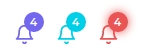
# Pill Badges As Notification
Use class badge prop with <feather-icon> components to add badges as notification. Use badge-classes="badge-{color}" prop for change the badge color.
<feather-icon icon="BellIcon" size="21" class="text-primary" badge="4" />
<feather-icon icon="BellIcon" size="21" class="text-info" badge="4" badge-classes="badge-info" />
<feather-icon icon="BellIcon" size="21" class="text-danger" badge="4" badge-classes="badge-danger badge-glow" />
Result:
# Block Pill Badge
Use .d-block class with <b-badge>, to display badge as a block element.
<b-badge pill class="d-block" variant="danger">Badge</b-badge>
Result: