# Switch
Switch component supports icon and custom colors to make it more informative
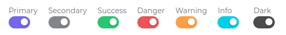
# Colors
To change the color of the radio use the .custom-control-{color} class.
<template>
  <!-- primary -->
  <div>
    <b-card-text class="mb-0">Primary</b-card-text>
    <b-form-checkbox checked="true" class="custom-control-primary" name="check-button" switch />
  </div>

  <!-- secondary -->
  <div>
    <b-card-text class="mb-0">Secondary</b-card-text>
    <b-form-checkbox checked="true" class="custom-control-secondary" name="check-button" switch />
  </div>

  <!-- success -->
  <div>
    <b-card-text class="mb-0">Success</b-card-text>
    <b-form-checkbox checked="true" class="custom-control-success" name="check-button" switch />
  </div>

  <!-- danger -->
  <div>
    <b-card-text class="mb-0">Danger</b-card-text>
    <b-form-checkbox checked="true" class="custom-control-danger" name="check-button" switch />
  </div>

  <!-- warning -->
  <div>
    <b-card-text class="mb-0">Warning</b-card-text>
    <b-form-checkbox checked="true" class="custom-control-warning" name="check-button" switch />
  </div>

  <!-- info -->
  <div>
    <b-card-text class="mb-0">Info</b-card-text>
    <b-form-checkbox checked="true" class="custom-control-info" name="check-button" switch />
  </div>

  <!-- dark -->
  <div>
    <b-card-text class="mb-0">Dark</b-card-text>
    <b-form-checkbox checked="true" class="custom-control-dark" name="check-button" switch />
  </div>
</template>
Result:
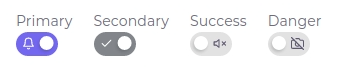
# Icons
Use class .switch-icon-left & .switch-icon-right in <b-form-checkbox switch> to create a switch with icon.
<template>
  <!-- primary -->
  <div>
    <b-card-text class="mb-0">Primary</b-card-text>
    <b-form-checkbox checked="true" class="custom-control-primary" name="check-button" switch>
      <span class="switch-icon-left"><feather-icon icon="BellIcon"/></span>
      <span class="switch-icon-right"><feather-icon icon="BellOffIcon"/></span>
    </b-form-checkbox>
  </div>

  <!-- secondary -->
  <div>
    <b-card-text class="mb-0">Secondary</b-card-text>
    <b-form-checkbox checked="true" class="custom-control-secondary" name="check-button" switch>
      <span class="switch-icon-left"><feather-icon icon="CheckIcon"/></span>
      <span class="switch-icon-right"><feather-icon icon="XIcon"/></span>
    </b-form-checkbox>
  </div>

  <!-- success -->
  <div>
    <b-card-text class="mb-0">Success</b-card-text>
    <b-form-checkbox class="custom-control-success" name="check-button" switch>
      <span class="switch-icon-left"><feather-icon icon="Volume2Icon"/></span>
      <span class="switch-icon-right">
        <feather-icon icon="VolumeXIcon" />
      </span>
    </b-form-checkbox>
  </div>

  <!-- danger -->
  <div>
    <b-card-text class="mb-0">Danger</b-card-text>
    <b-form-checkbox class="custom-control-danger" name="check-button" switch>
      <span class="switch-icon-left"><feather-icon icon="CameraIcon"/></span>
      <span class="switch-icon-right"><feather-icon icon="CameraOffIcon"/></span>
    </b-form-checkbox>
  </div>
</template>
Result:
← Radio Vue Select →