# Core Layouts
There's three layout in core same your layouts.
- Full Layout
- Vertical Layout
- Horizontal Layout
Let's dive in what each of them has to offer so you can customize the template and render your own content in our flexible layouts.
# 1. Full Layout
Full layout is really simple it just have layout classes wrapper and default slot.
# 2. Vertical Layout
Vertical layout provides below slots/scoped-slots to render your custom content in component:
# navbar (scoped slot)
Use this scoped slot to render your custom navbar. You need to use this scoped slots to override our template's default navbar, you will not use our demo navbar in your project, right? 😉
<template>
<layout-vertical>
<router-view />
<!-- Using navbar scoped slot -->
<div
slot="navbar"
class="px-1"
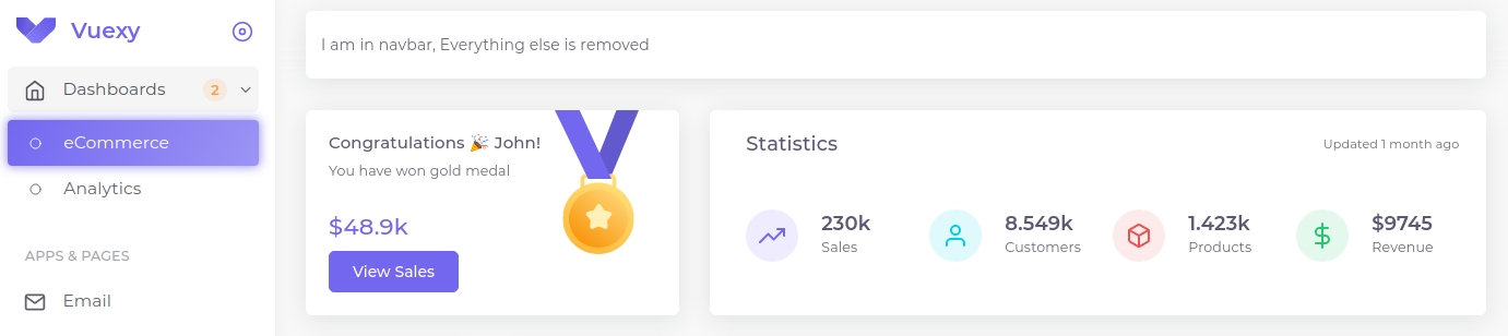
>
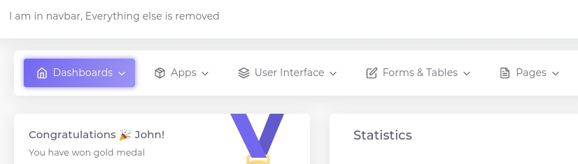
<p class="mb-0">I am in navbar, Everything else is removed</p>
</div>
<app-customizer
v-if="showCustomizer"
slot="customizer"
/>
</layout-vertical>
</template>
<script>
import LayoutVertical from '@core/layouts/layout-vertical/LayoutVertical.vue'
import AppCustomizer from '@core/layouts/components/app-customizer/AppCustomizer.vue'
import { $themeConfig } from '@themeConfig'
export default {
components: {
AppCustomizer,
LayoutVertical,
},
data() {
return {
showCustomizer: $themeConfig.layout.customizer,
}
},
}
</script>
Result:
Slot Props:
| name | description | type |
|---|---|---|
| toggleVerticalMenuActive | Toggle visibility of vertical menu (For small screens) | function |
| navbarBackgroundColor | Configured bg color of navbar in themeConfig (BS variants) | string |
| navbarTypeClass | Navbar wrapper classes (Just for reference) | string |
# vertical-menu-header (scoped slot)
Use this scoped slot to render your custom vertical nav menu header. Useful for changing title and add extra actions.
<template>
<layout-vertical>
<router-view />
<div
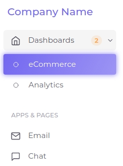
slot="vertical-menu-header"
class="d-flex align-items-center h-100"
>
<h1 class="font-medium-5 mb-0 text-primary">
Company Name
</h1>
</div>
<app-customizer
v-if="showCustomizer"
slot="customizer"
/>
</layout-vertical>
</template>
<script>
import LayoutVertical from '@core/layouts/layout-vertical/LayoutVertical.vue'
import AppCustomizer from '@core/layouts/components/app-customizer/AppCustomizer.vue'
import { $themeConfig } from '@themeConfig'
export default {
components: {
AppCustomizer,
LayoutVertical,
},
data() {
return {
showCustomizer: $themeConfig.layout.customizer,
}
},
}
</script>
Result:
Slot Props:
| name | description | type |
|---|---|---|
| toggleVerticalMenuActive | Toggle visibility of vertical menu (For small screens' close btn) | function |
| toggleCollapsed | Toggle vertical menu collapsed or expanded | function |
| collapseTogglerIcon | icon type to show | string [unpinned/pinned/close] |
# default
This for rendering router-view tag. It doesn't have any slot props.
# breadcrumb
breadcrumb slot provides full control over rendering breadcrumb however you want.
TIP
You can use our AppBreadcrumb.vue core component as refrence and create custom breadcrumb component.
In future update will try to make it more generic so you don't have to extend it and can use our core component.
<template>
<layout-vertical>
<router-view />
<div
slot="breadcrumb"
class="p-1"
>
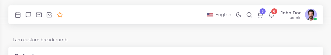
I am custom breadcrumb
</div>
<app-customizer
v-if="showCustomizer"
slot="customizer"
/>
</layout-vertical>
</template>
<script>
import LayoutVertical from '@core/layouts/layout-vertical/LayoutVertical.vue'
import AppCustomizer from '@core/layouts/components/app-customizer/AppCustomizer.vue'
import { $themeConfig } from '@themeConfig'
export default {
components: {
AppCustomizer,
LayoutVertical,
},
data() {
return {
showCustomizer: $themeConfig.layout.customizer,
}
},
}
</script>
Result:
# footer
This is useful to render your content in footer.
<template>
<layout-vertical>
<router-view />
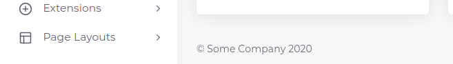
<div slot="footer">
<p class="mb-0">
© Some Company {{ new Date().getFullYear() }}
</p>
</div>
<app-customizer
v-if="showCustomizer"
slot="customizer"
/>
</layout-vertical>
</template>
<script>
import LayoutVertical from '@core/layouts/layout-vertical/LayoutVertical.vue'
import AppCustomizer from '@core/layouts/components/app-customizer/AppCustomizer.vue'
import { $themeConfig } from '@themeConfig'
export default {
components: {
AppCustomizer,
LayoutVertical,
},
data() {
return {
showCustomizer: $themeConfig.layout.customizer,
}
},
}
</script>
Result:
# customizer
This slot don't have any default rendering. You can use this slot to render customizer in your layout. As there is high chances that you don't want customizer in your project we just provided slot for demo purpose. If you are not using this slot just remove it's code from your layout. Out package provides usage of this slot.
If you are using this slot and themeConfig to toggle customizer make sure you respect theme config option like in blow code snippet.
<template>
  <layout-vertical>

    <router-view />

    <app-customizer
      v-if="showCustomizer"
      slot="customizer"
    />

  </layout-vertical>
</template>

<script>
import LayoutVertical from '@core/layouts/layout-vertical/LayoutVertical.vue'
import AppCustomizer from '@core/layouts/components/app-customizer/AppCustomizer.vue'
import { $themeConfig } from '@themeConfig'

export default {
  components: {
    AppCustomizer,
    LayoutVertical,
  },
  data() {
    return {
      showCustomizer: $themeConfig.layout.customizer,
    }
  },
}
</script>
# 3. Horizontal Layout
Horizontal layout provides below slots/scoped-slots to render your custom content in component:
# navbar (scoped slot)
Same as vertical layout. For rendering your own navbar content.
<template>
  <layout-horizontal>

    <router-view />

    <!-- Using navbar scoped slot -->
    <div
      slot="navbar"
      class="px-2 py-2"
    >
      <p class="mb-0">
        <span>I am in navbar, Everything else is removed</span>
      </p>
    </div>

    <app-customizer
      v-if="showCustomizer"
      slot="customizer"
    />
  </layout-horizontal>

</template>

<script>
import LayoutHorizontal from '@core/layouts/layout-horizontal/LayoutHorizontal.vue'
import AppCustomizer from '@core/layouts/components/app-customizer/AppCustomizer.vue'
import { $themeConfig } from '@themeConfig'

export default {
  components: {
    LayoutHorizontal,
    AppCustomizer,
  },
  data() {
    return {
      showCustomizer: $themeConfig.layout.customizer,
    }
  },
}
</script>
Result:
Slot Props:
| name | description | type |
|---|---|---|
| toggleVerticalMenuActive | Toggle visibility of vertical menu (For small screens) | function |
# vertical-menu-header (scoped slot)
Everything is same as vertical layout. Same vertical menu in rendered in horizontal menu when window breakpoint reaches lg.
# default slot
Same as vertical layout
# breadcrumb slot
Same as vertical layout
# footer slot
Same as vertical layout
# customizer slot
Same as vertical layout